DrivingSales Rebrand
Background
I was lucky enough to be the third employee to join DrivingSales back in 2010. Over the next five years, as we expanded to about 40 employees, we invented and grew more than 15 separate brands under the DrivingSales umbrella. In 2015, we began the process of bringing most of those separate brands together under a single mark and single brand.
Project
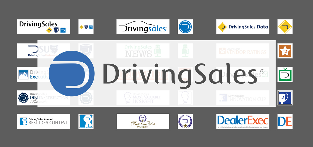
Take a look at our brand portfolio in early 2015:
One million logos and icons
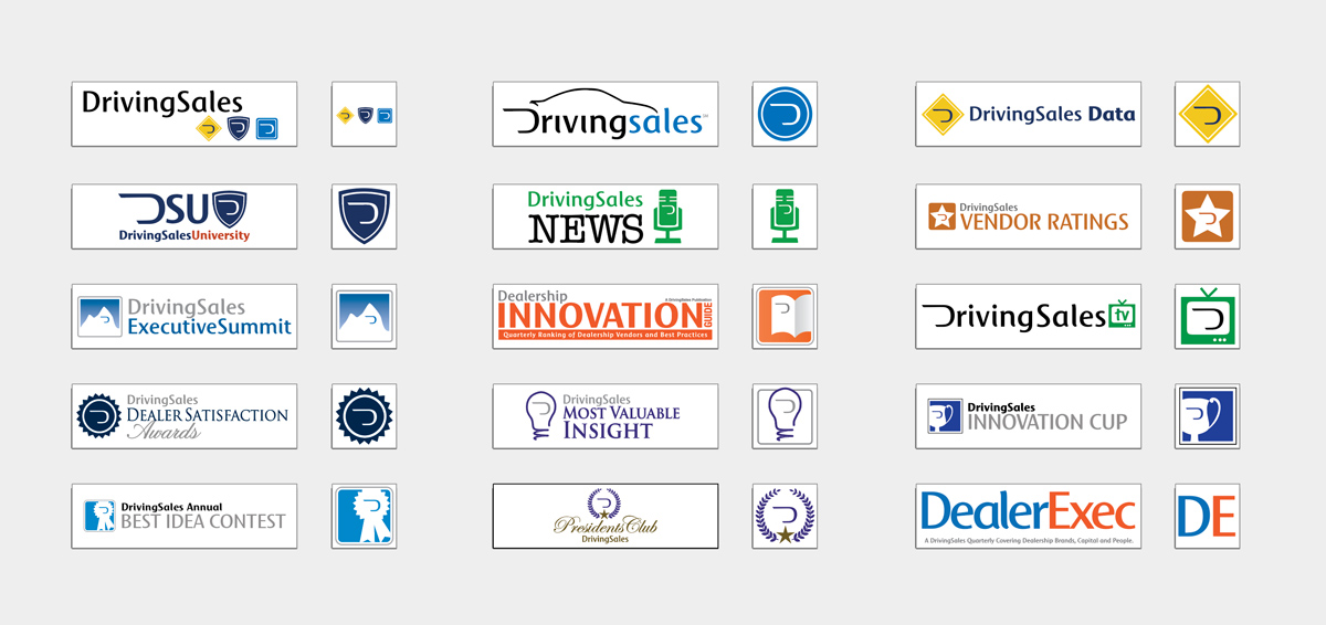
We (Director of Marketing, another designer, and I) worked up some basic ideas and then hired an agency to refine some options for us. In the end, we were able to agree on this:
New DrivingSales corporate logo
The colors and fonts used across the company were all over the place. We selected a corporate font and outlined typography usage and color palettes.

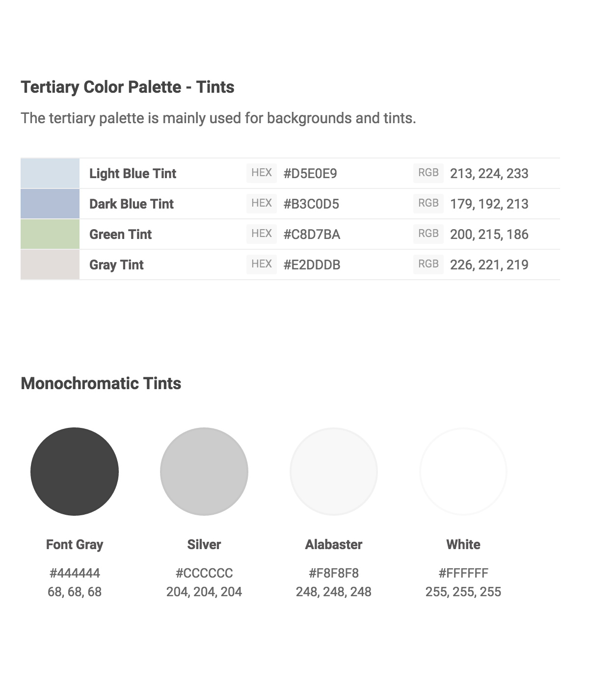
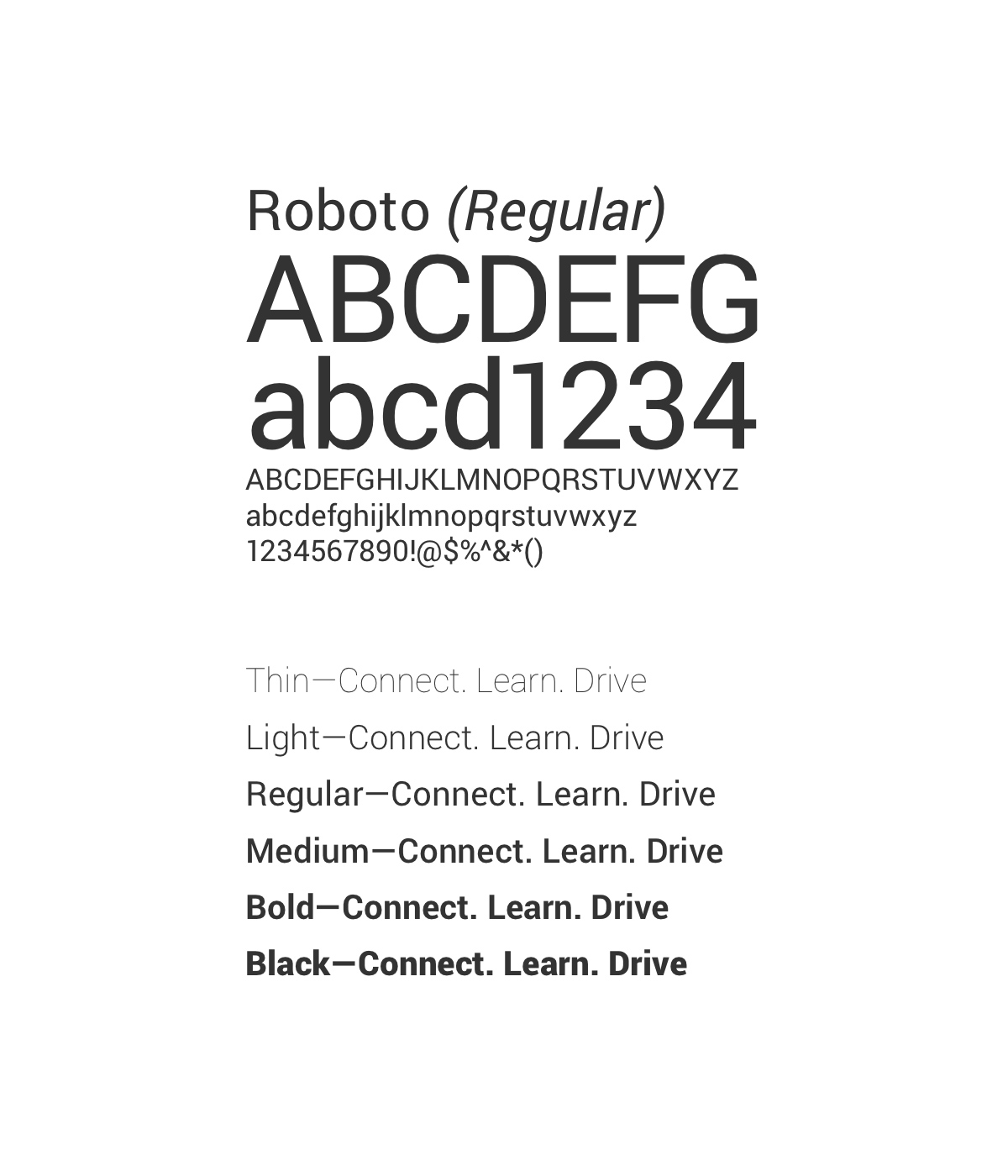
Corporate colors and fonts
Now comes the ongoing effort of updating everything. This is the worst and hardest part of any rebrand: educating your team and your customers on how to properly use the new brand. It will probably take us a year or more to switch out all the old assets, but we're on a much better path.

Update everything
Takeaways
A corporate rebrand takes a lot of time (we worked on this one for over four months). Don't ask too many people for input; everyone has an opinion. Just make decisions and move forward. Frequently ask the question, "will this make it easier for the industry to do business with us?" If the answer is no, you should rethink what you're doing.