Simple Playtime Native App & Logo
Background
The Simple Playtime creators were maintaining an Instagram account that shared activity ideas for little kids; well, for adults to keep little kids busy. They wanted to turn their idea into a mobile app.
Mobile App Prototype
This was a fun project to build out. We started with some basic sketches and then moved into Sketch for some rough wireframes. We made a v1 prototype in InVision to make sure we had accounted for the right views and basic interactions.
Once we all felt good about what we were after, I designed out each view and compiled a v2 prototype.
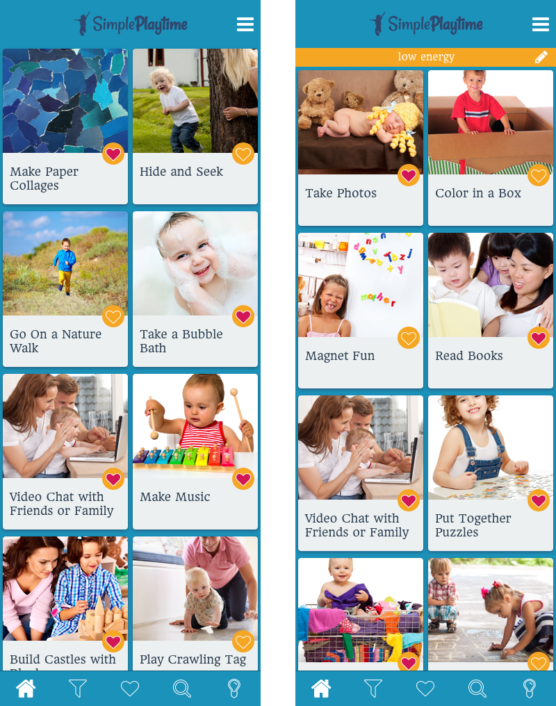
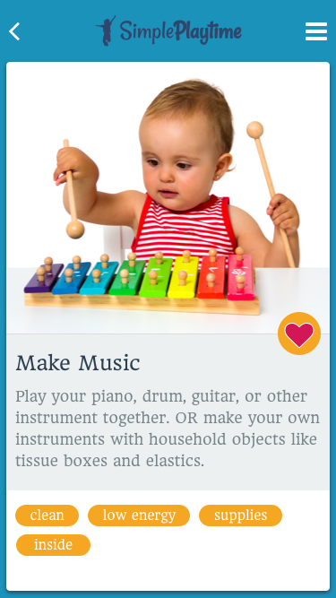
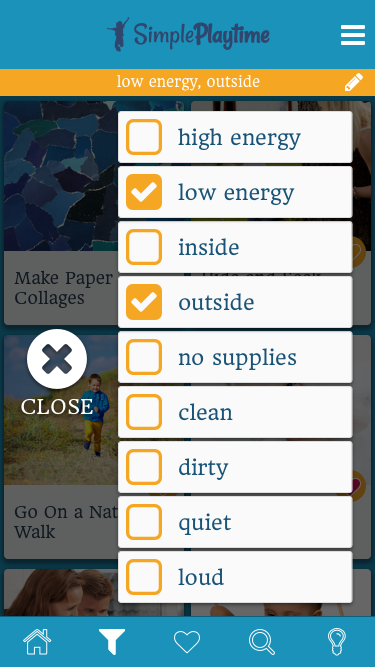
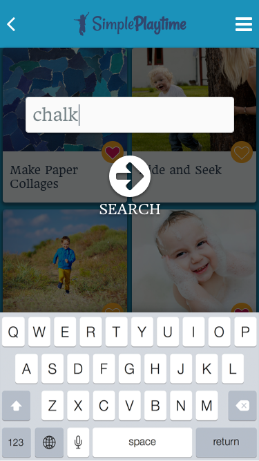
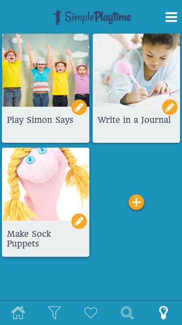
GALLERY: Primary screens of the mobile app
One feature that surfaced as we went through the design process was a space for the user to save their own ideas.

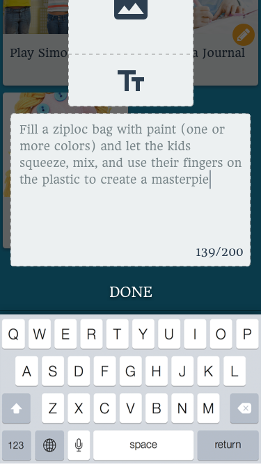

GALLERY: Users can save their own ideas in the app
Saving time and promoting consistency with Sketch symbols
Logo Project
We began discussing a logo for the Simple Playtime brand. We wanted something simple and playful {go figure}; something flexible so it could be used against fun, bold colors without commitment a specific palette.
Font choices for the wordmark
With simplicity in mind, I suggested a simple typographic treatment: the two words close together with one bolder than the other for legibility(it's a popular approach). I put several font options in front of them. Because the mobile app would likely have a web component to it (blog, app landing page, etc.), I focused on open source Google Fonts.
They decided on “Rancho Regular”. I clean up the t+i ligature and adjusted some character spacing. I also filled in the dot over the simple i to feel more consistent with the ligatured playtime i. Everyone was happy.
GALLERY: Testing the logo on various backgrounds, the final logo, and an assortment of icon options
After looking at use cases, we realized we would need some kind of abbreviated logo or icon for use on social profiles and mobile app icons. Again, we wanted something playful, but simple. We settled on a vector of a child jumping in exultant play. I tested the mark on various color backgrounds to make sure it was clean and recognizable.
Simple Playtime Instagram Account
Takeaways
Simplicity is often more difficult and requires much more effort/discipline than complexity.
A logo design exercise does not have to be a long, drawn out process. If you and your client can get on the same page, you might be lucky enough to move through the cycle quickly.